September 3, 2026
9 Kitchen Cabinet Stain Colors for Austin Homes

You've brought home three stain samples, and the one that looked balanced in the showroom now looks much darker beside an Austin window. Another reads unexpectedly golden against the existing floor, while a cooler sample turns flat beneath warm LED lighting. That's normal. Kitchen cabinet stain colors change with wood species, sheen, natural light, nearby materials, and the warm, bright conditions common across Central Texas.
This roundup compares nine stain directions, from transparent natural wood to ebony, by visual effect, design compatibility, wood character, room pairing, lighting behavior, maintenance trade-offs, and practical sampling steps. It also shows when refinishing can create the look without demolition. Restore My Kitchen ATX offers cabinet restaining, refinishing, and coordinated remodeling for homes in Austin, West Lake Hills, Bee Cave, Round Rock, and surrounding communities.
You'll find:
- Espresso Dark Brown
- Golden Honey
- Weathered Gray
- Rich Walnut
- White Wash
- Ebony Black
- Driftwood Gray
- Charcoal Gray
- Natural Clear
- Choose the Finish That Fits Your Home
Table of Contents
- 1. Espresso Dark Brown
- 2. Golden Honey
- 3. Weathered Gray
- 4. Rich Walnut
- 5. White Wash
- 6. Ebony Black
- 7. Driftwood Gray
- 8. Charcoal Gray
- 9. Natural Clear Transparent
- 9-Option Kitchen Cabinet Stain Comparison
- Choose the Finish That Fits Your Home
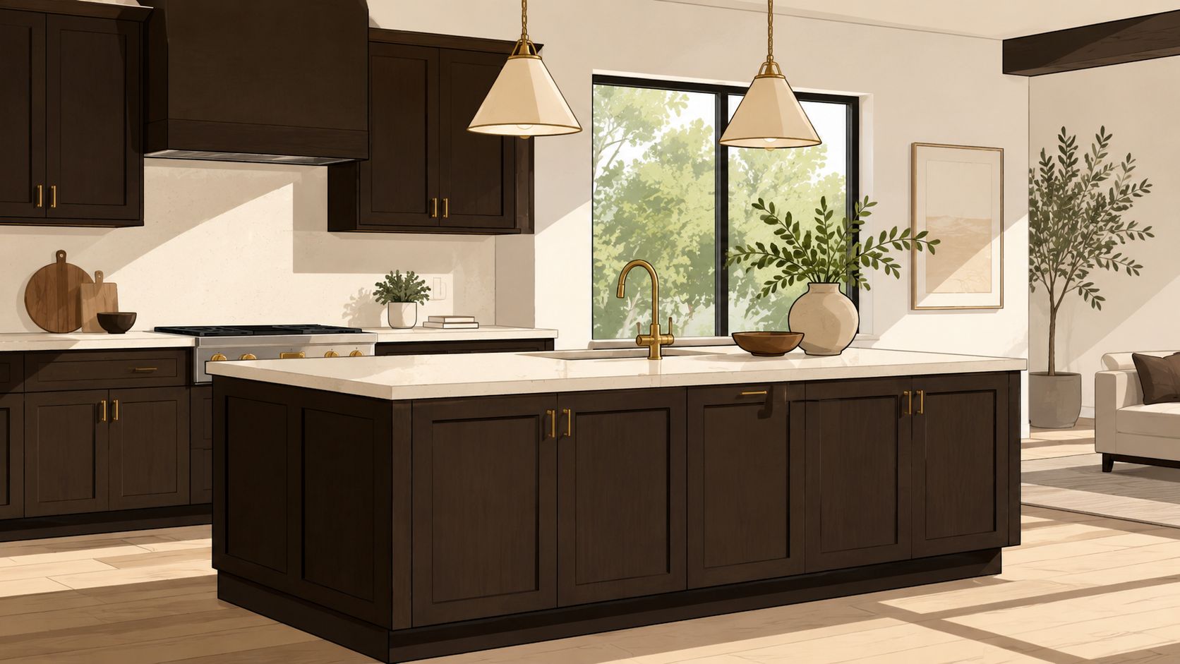
1. Espresso Dark Brown
Espresso is a deep brown finish for homeowners who want cabinetry to act as a strong architectural element. It suits contemporary and transitional kitchens particularly well, including bold interiors in West Lake Hills, Bee Cave, Dripping Springs, Steiner Ranch, and Lakeway. On white oak, the open grain can remain visible beneath the dark color. On maple, the result may look smoother and more uniform, but careful preparation matters because tight-grained woods can absorb stain unevenly, as explained in this wood-species staining guide.
This color absorbs light, so it works best where large windows provide strong daylight. A Cedar Park open-concept kitchen might pair espresso cabinets with pale quartz and stainless appliances, while a Round Rock transitional kitchen could soften the contrast with a white subway tile backsplash. For a Georgetown kitchen, an espresso island with lighter perimeter cabinetry can create depth without making every wall of storage feel heavy.
Pairing and protection
Use white, cream, or light gray counters to keep the room visually balanced. Brushed brass and matte black hardware both work, although brass adds more warmth against the brown. Under-cabinet lighting and well-placed overhead fixtures are important, especially in kitchens with limited daylight.
A spray-applied finish is the safer route for consistent color distribution across doors and drawer fronts. Ask about a durable topcoat with UV resistance, particularly where Austin-area windows expose cabinetry to strong sun. Espresso also has a practical advantage: its depth can make everyday dust and minor visual inconsistencies less obvious than they would be on a pale finish.
Practical rule: Test espresso on your actual cabinet wood and view it beside the floor at different times of day. A showroom chip can't predict how your kitchen will absorb the color.
2. Golden Honey
Golden Honey brings medium-depth warmth and visible grain to kitchens that should feel welcoming rather than formal. It can work in a Leander ranch kitchen with wood beams, a Buda or Kyle farmhouse, or a Hutto kitchen with simple contemporary hardware. The finish is especially persuasive on oak, where the open pores give the stain texture and even color. Maple may produce a quieter effect, and the same sample can look less richly textured.
A traditional Leander kitchen with limestone counters could use Golden Honey throughout for a cohesive, established look. In Georgetown, a honey-stained island can warm up painted white perimeter cabinets. Driftwood homes often pair this direction with shiplap, natural stone, or bronze hardware, while a Cedar Park ranch kitchen can use recessed lighting to bring out the grain without making the finish feel glossy.
Make the warmth intentional
Golden Honey works best when the surrounding materials acknowledge its warmth. Choose natural stone or warm-toned quartz instead of a counter with a strongly blue-gray cast. Brushed brass, bronze, and oil-rubbed bronze hardware reinforce the finish, while cooler metals can make the cabinets look more yellow by comparison.
A satin sheen offers enough reflection to enrich the color without creating a plastic appearance. Under-cabinet task lighting helps the grain read clearly, particularly in kitchens where the cabinets sit beneath deep uppers or shaded soffits. Ask the finisher to develop the color gradually rather than relying on one heavy application. Two thin coats can provide more controlled depth and a more even result.
Golden Honey is a good choice when the existing floors already have warm undertones and replacement would create unnecessary contrast. Test the stain against the floor, backsplash, and countertop together. A small cabinet door is more useful than a loose board because it shows how the full surface, edges, and grain respond.
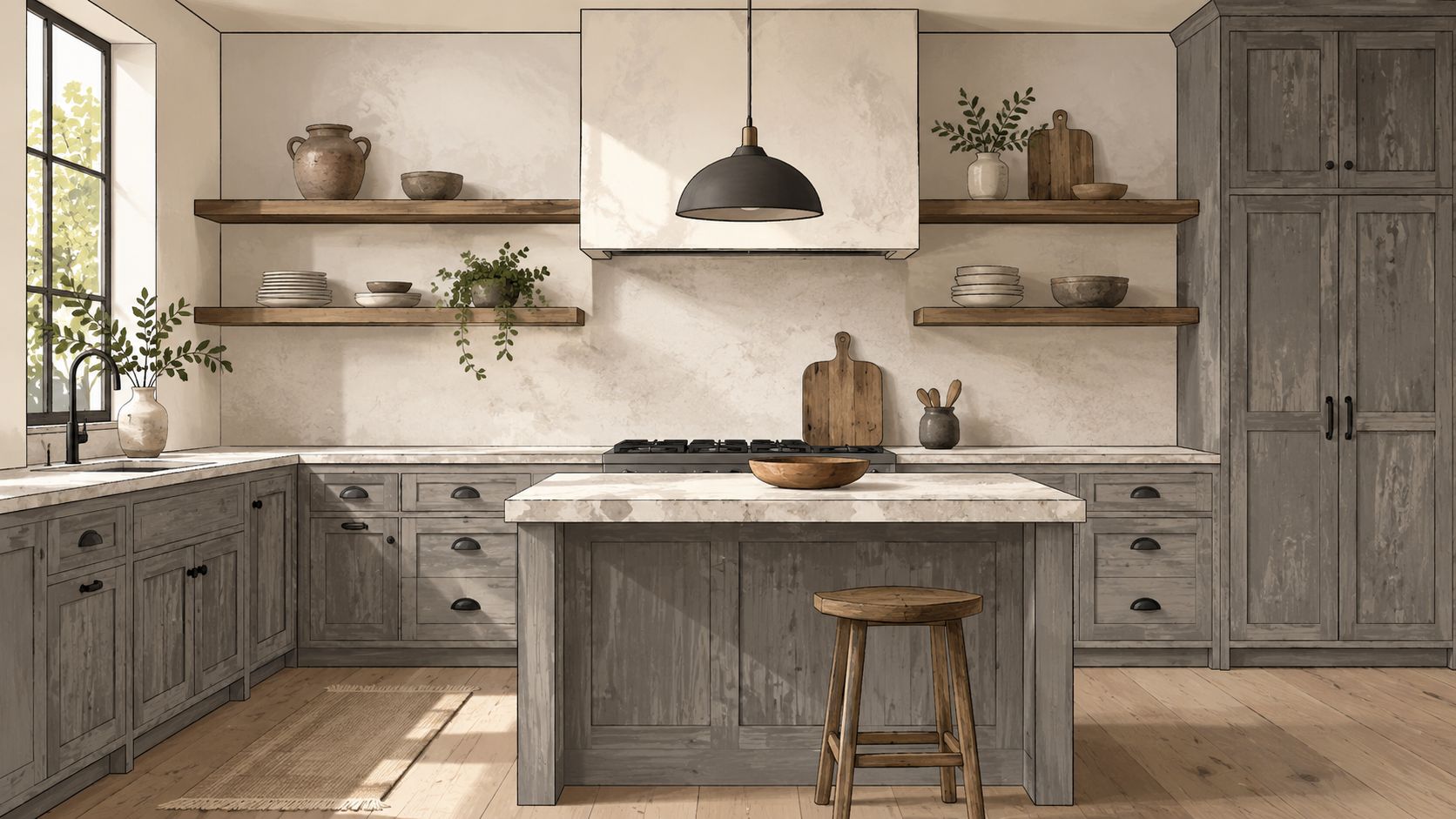
3. Weathered Gray
Weathered Gray combines gray and brown for a finish that feels aged without looking neglected. It suits modern farmhouse and transitional kitchens in West Lake Hills, Bee Cave, Steiner Ranch, and Round Rock, especially where the architecture already includes limestone, cedar, native stone, reclaimed wood, or black metal details. Its muted character also works well with the natural materials found in Central Texas homes.
Cedar Park homeowners might pair Weathered Gray cabinets with white subway tile and concrete-look counters. In Dripping Springs, a gray-stained island can sit comfortably beside white perimeter cabinets, brass hardware, and open shelving. A Round Rock new build could use the finish across the cabinet run, then add warm wood shelves to keep the room from feeling overly cool.
Let the grain carry the finish
This color needs visible, attractive grain. White oak and other open-pore woods can give the gray-brown wash enough texture to feel intentional. On a smoother or less consistent substrate, the finish may look flat or uneven. Oak generally accepts stain more uniformly than maple, so the wood itself should guide the final sample decision.
Choose matte or low-sheen protection if you want an authentic weathered appearance. A water-based, low-VOC topcoat can help preserve the gray direction without adding the amber cast associated with some warmer coating systems. Pair the cabinets with gray, greige, or cool white counters, then introduce warmth through shelves, stools, flooring, or hardware.
For existing cabinetry, cabinet refinishing services may achieve this change without removing the cabinet boxes or replacing the entire kitchen. The preparation still needs to be thorough. A finisher must evaluate the existing topcoat, repair damage, clean away cooking residue, and apply the new system evenly.
4. Rich Walnut
Rich Walnut is deeper and more complex than a straightforward medium brown. Its reddish or purplish undertones create a furniture-like effect that can anchor a luxury kitchen in Austin, Georgetown, Westlake, Bee Cave, Lakeway, or Steiner Ranch. That complexity is also its main risk. If the floor, backsplash, or surrounding wood carries a competing orange or yellow undertone, Walnut may make the mismatch more visible.
A Lakeway gourmet kitchen could use walnut-stained built-ins around a stainless range, while an Austin new-construction kitchen might combine the finish with white marble and polished brass. In Round Rock, walnut perimeter cabinets with a painted island can deliver formality without making the whole room feel dark. A Steiner Ranch kitchen with dark granite, pendant lights, and crown molding can support the traditional side of the finish, but the cabinetry must have a quality substrate because Walnut highlights rather than disguises wood character.
Control the red-brown balance
Warm lighting makes Walnut feel richer. If the kitchen already has strong warm LEDs, sample the finish at night before approving it. Pale counters provide relief, while marble, granite, and high-end quartz reinforce the premium direction. Polished brass, oil-rubbed bronze, and black iron hardware are natural companions.
Walnut is often more successful as an island or focal area when the perimeter is lighter or painted. That approach gives the stain a defined role and reduces the chance that the room becomes visually heavy. A controlled spray booth also helps create even color development across doors and panels, followed by a durable polyurethane or conversion varnish topcoat.
For existing hardwood cabinetry, cabinet restaining can change the tone while retaining usable cabinet components. The feasibility depends on the current finish, wood species, veneer condition, and desired color shift. Rich Walnut isn't a universal fix for dated cabinets, but it can be an elegant solution when the cabinetry has sound construction and attractive grain.
5. White Wash
White Wash is a pale, silvery-blonde treatment that keeps the wood visible while making the kitchen feel lighter. It suits contemporary farmhouse, Scandinavian, and organic modern interiors in Cedar Park, Leander, Pflugerville, Georgetown, Hutto, and Dripping Springs. Unlike opaque paint, a semi-transparent wash lets pores and grain remain part of the design.
The wood matters more here than with many darker stains. White oak can provide the open, linear grain that makes the finish look deliberate. Maple may read cleaner and quieter, which can be useful for minimalist interiors but may not deliver the textured appearance shown in a sample made on oak. Because the finish exposes variation, dents, uneven grain, and previous repairs may remain visible.
Use light, but don't erase character
A Dripping Springs modern farmhouse could combine White Wash cabinets with light oak grain, a gray-stained island, and open shelving. In Round Rock, whitewashed perimeter cabinets can support concrete counters and a darker island. A Hutto kitchen with pale wood counters and brushed brass can take the Scandinavian route without losing material warmth.
Use bright or soft gray backsplash materials and light counters to keep the palette coherent. Matte or satin protection supports the handcrafted appearance better than a highly reflective coating. Under-cabinet lighting is useful because it reveals the grain instead of allowing the cabinets to become a blank pale plane.
White Wash also deserves an honest maintenance conversation. Frequently handled areas may develop wear patterns that look like intentional patina, but only if the underlying preparation and topcoat are sound. Consider using it on an island or selected cabinet sections when the perimeter needs more visual weight. Sample it beside the actual floor and hardware, since a warm floor can make the wash look creamier while cool daylight can make it appear more silvery.
6. Ebony Black
Ebony Black is nearly black, highly dramatic, and best treated as an architectural accent rather than a default whole-kitchen solution. It can suit a bold Austin, Bee Cave, West Lake Hills, or Steiner Ranch interior with strong daylight, carefully planned artificial lighting, and materials that can hold their own beside such a dark finish.
An ebony island surrounded by white cabinets creates a clear focal point. A Round Rock modern kitchen might use black-stained cabinetry around a stainless range, while a Dripping Springs entertainment kitchen could frame a fireplace with dark built-ins and open shelving. The finish forces the backsplash, countertops, lighting, and hardware to become visible design decisions rather than background elements.
Keep the room from feeling enclosed
Use Ebony Black on an island, range hood, accent wall, or built-in before committing to every cabinet. Light counters and a pale backsplash provide necessary contrast. Polished brass, black iron, and stainless hardware all work, but the hardware should be intentional because a small, ordinary knob can disappear against the dark surface.
Lighting needs to come from several layers. Under-cabinet fixtures illuminate work surfaces, overhead lighting prevents corners from disappearing, and pendants can give the island enough presence. A kitchen with limited windows may not support a full ebony treatment comfortably, even if the sample looks compelling in bright retail lighting.
Satin or higher-sheen protection can add depth and prevent the finish from looking chalky. A controlled spray application makes it easier to inspect the surface for unevenness before installation. Always test the sample in actual morning and evening conditions. Black stain can reveal preparation flaws more readily than a forgiving medium brown, so sanding, cleaning, repairs, and topcoat selection deserve as much attention as the color itself.
7. Driftwood Gray
Driftwood Gray sits between a pale wash and a dark brown. Its gray-beige base feels relaxed, while its warmth keeps it from becoming as stark as a cool gray. That makes it a useful choice for transitional kitchens in Lakeway, Driftwood, Steiner Ranch, Buda, and Leander, particularly where stone, wood ceilings, or other Hill Country details already shape the room.
A Buda cottage kitchen could pair Driftwood Gray cabinets with light counters and open shelving. In Lakeway, limestone counters and recessed lighting can bring out the finish's soft variation. A Driftwood ranch kitchen might add shiplap and natural wood counters, while a Leander remodel could use the stain on the perimeter and reserve a white-painted island for contrast.
Balance beige and gray
Driftwood Gray performs best beside warm gray, beige, cream, or natural stone counters. Brushed brass and bronze hardware support the warm undertone, while natural wood pulls the finish toward an organic look. If the room contains cool white counters and blue-gray tile, the cabinets may look more beige than expected, so sample testing is essential.
Satin protection gives the surface a refined glow without turning it glossy. Under-cabinet lighting helps the wood grain remain visible, especially in kitchens where daylight changes sharply across the work surfaces. This color can work across a full kitchen more easily than Ebony Black because it adds character without creating the same visual weight.
Test the sample against both flooring and backsplash. A finish that looks neutral in direct daylight may look warmer beneath evening LEDs. Central Texas homes also experience strong sun exposure, so ask how the selected coating system is intended to protect the color. The right answer depends on the wood, existing finish, product system, and installation conditions, not only on the name Driftwood Gray.
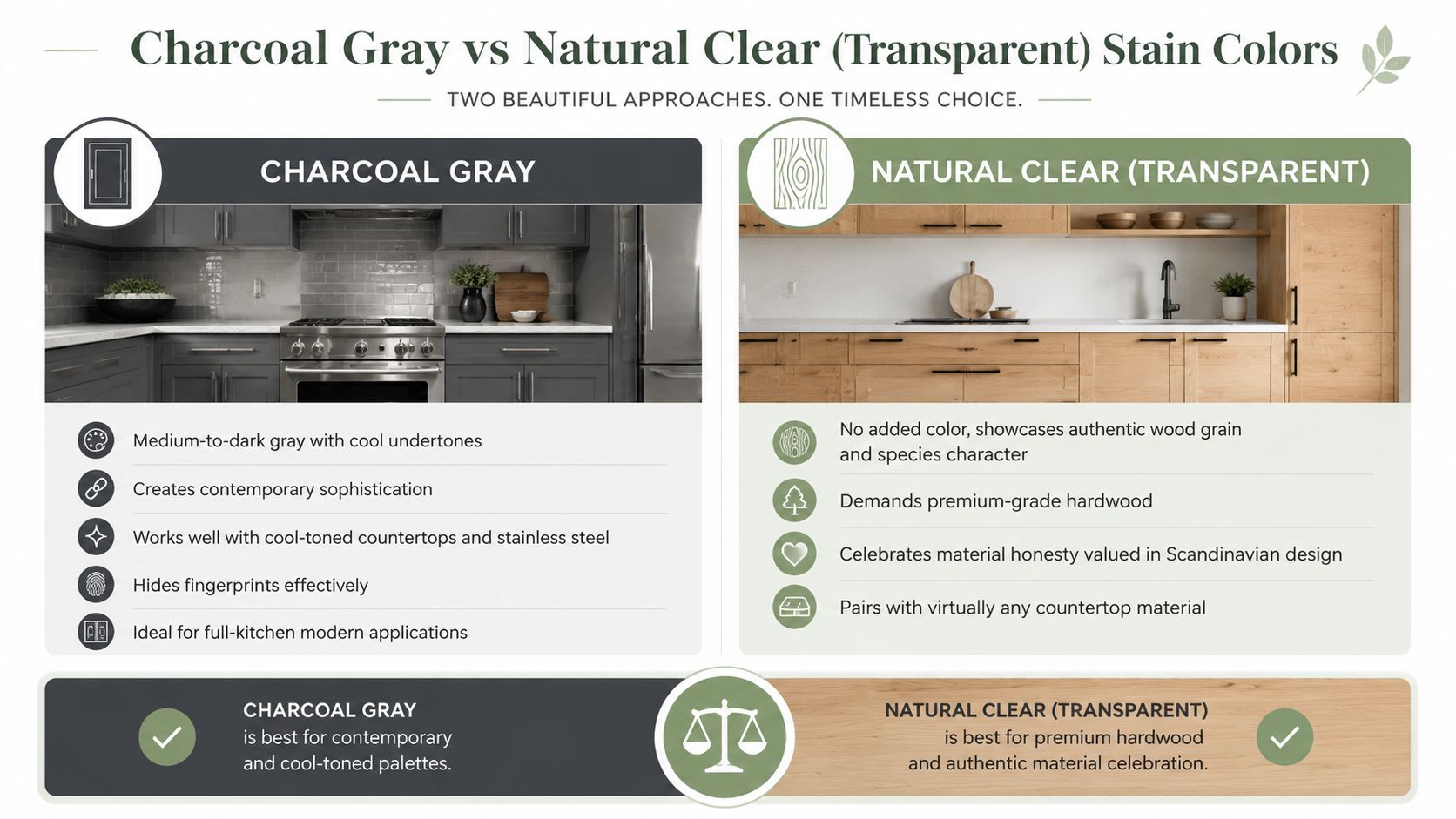
8. Charcoal Gray
Charcoal Gray offers contemporary depth without the commitment of a nearly black surface. Its subtle blue or green undertones can look crisp with white quartz, stainless appliances, and minimalist backsplashes. It suits modern kitchens in West Lake Hills, Georgetown, Round Rock, Cedar Park, Pflugerville, and Lakeway, especially where the room already has clean lines and limited decorative trim.
A Round Rock kitchen might use Charcoal Gray throughout with white counters and stainless appliances. In Cedar Park, charcoal perimeter cabinets can support a white-painted island and concrete-look counters. A Pflugerville minimalist kitchen may benefit from the finish's restraint, while a Lakeway two-tone design could place charcoal around the range and use white cabinetry elsewhere.
Respect the cool undertone
Choose cool white, gray, or light blue quartz if you want the gray to remain crisp. Brushed nickel, black, and polished chrome hardware generally integrate more easily than warm brass or bronze, which can fight the blue or green cast. Stainless appliances and modern backsplash materials reinforce the clean, contemporary direction.
Charcoal can work as a full-kitchen stain when the room has enough daylight and a counter that provides contrast. It also works well on lower cabinets beneath white uppers, a combination that keeps the eye from settling on one uninterrupted dark field. Pendant or track lighting with a cooler color temperature can support the intended effect, but test the finish under the actual bulbs used in the home.
The substrate still controls the result. Open-grain oak may show a stronger linear pattern beneath the charcoal, while maple can look smoother and may require more exact preparation for an even appearance. A spray-booth application helps the doors and drawer fronts match, but the boxes and end panels need equal attention so the finished kitchen doesn't show visible shifts from one surface to another.
9. Natural Clear Transparent
Natural Clear is less about adding color and more about protecting the wood that already exists. The finish is transparent or nearly transparent, so walnut, cherry, white oak, hickory, and maple each remain visibly different. It suits premium, contemporary, and Scandinavian-influenced kitchens in Dripping Springs, Georgetown, Hutto, Cedar Park, and Westlake where material authenticity matters more than a uniform color statement.
A Westlake kitchen with walnut cabinetry can let the natural grain carry the entire design. Clear-finished white oak in a Round Rock contemporary home can provide texture without a heavy stain. Maple with pale counters and simple hardware can create a clean minimalist look, while cherry in a Georgetown transitional kitchen can show its natural warmth without adding another strong color.
Preparation becomes the design
Clear finishes expose everything. Color variation, repairs, end-grain differences, sanding marks, and uneven substrate preparation will remain part of the visual result. That means the cabinet doors should be evaluated individually, and the selected species should have grain and color variation the homeowner likes.
Use a durable water-based clear finish or conversion varnish when preserving a lighter appearance is important. Pair the cabinets with restrained counters and backsplash materials so the grain remains the focal point. Contemporary hardware in black, brushed metal, or simple brass can reinforce the honest-material approach without competing with it.
A consistent wood species across the kitchen generally creates the calmest result. If the existing cabinets combine different materials, ask for samples from each visible area rather than approving one door alone. Texas humidity and seasonal changes also make coating selection important, so review guidance on protecting cabinet finishes in Texas humidity before choosing the final system.
9-Option Kitchen Cabinet Stain Comparison
| Finish | 🔄 Implementation Complexity | ⚡ Resource Requirements | ⭐ Expected Outcome | 📊 Ideal Use Cases | 💡 Key Advantages / Tips |
|---|---|---|---|---|---|
| Espresso Dark Brown | High, precise, spray-friendly application; careful on softwoods | Premium polyurethane with UV protection; spray booth recommended; good prep | ⭐⭐⭐⭐, Dramatic, formal depth; masks minor imperfections | Modern/transitional kitchens, islands, open-concept homes with abundant light | Pair with light countertops and strong lighting; test samples; use brushed brass or matte black hardware |
| Golden Honey | Moderate, forgiving; two thin coats recommended | Standard prep; satin polyurethane; works on common cabinet stocks | ⭐⭐⭐⭐, Warm, grain-enhancing, versatile | Traditional, farmhouse, and broad transitional kitchens | Pairs well with warm metals; works across many countertops; test on wood species |
| Weathered Gray | High, needs quality grain and controlled finish to avoid color shifts | Quality wood species; water-based low‑VOC topcoat to prevent yellowing; skilled applicator | ⭐⭐⭐⭐, Muted, aged patina; contemporary-rustic designer look | Modern farmhouse, Hill Country homes, two-tone schemes | Use straight-grain wood; choose matte sealer; pair with cool-toned counters |
| Rich Walnut | High, multiple coats; best on premium hardwoods; expert application | Premium hardwood substrate; conversion varnish or high-end topcoat; spray booth ideal | ⭐⭐⭐⭐⭐, Luxurious, furniture-grade warmth with rich depth | High-end kitchens, statement islands, traditional/transitional upscale homes | Reserve for premium cabinets; use warm 2700K lighting and polished hardware |
| White Wash | Moderate, hand-applied technique; skill needed to avoid patchiness | Semi-transparent white stain; satin/matte topcoat; good grain selection | ⭐⭐⭐⭐, Bright, airy, artisanal; opens small spaces | Scandinavian, contemporary farmhouse, bright/compact kitchens | Showcase attractive grain; add under-cabinet lighting; expect more frequent maintenance |
| Ebony Black | Very high, demands perfect booth conditions and lighting | Spray application; UV-stable topcoat; strong lighting design; high prep standards | ⭐⭐⭐⭐⭐, Maximum drama; gallery-like focal point | Statement islands/accents in luxury contemporary kitchens with ample light | Use as accent or island only; pair with light counters and statement hardware; test in-situ |
| Driftwood Gray | Moderate, semi-transparent, forgiving application | Standard prep; satin topcoat; compatible with many wood types | ⭐⭐⭐⭐, Soft, sun‑bleached balance, approachable and bright | Transitional, coastal, and farmhouse kitchens; homes with wood/stone features | Pair with warm countertops and brass/wood hardware; sample in varied lighting |
| Charcoal Gray | Moderate, requires even application and good lighting | Quality stain; professional spray recommended; careful topcoat | ⭐⭐⭐⭐, Contemporary sophistication without full black commitment | Full-kitchen contemporary/transitional layouts; cool-toned palettes | Pair with cool countertops and modern hardware; consider two-tone schemes |
| Natural Clear (Transparent) | High, requires flawless prep and premium wood selection | Premium hardwood species; non‑yellowing water-based or conversion varnish; meticulous surface prep | ⭐⭐⭐⭐⭐, Authentic material showcase; timeless when substrate is high quality | Premium hardwood cabinetry, Scandinavian and minimalist kitchens | Use only on high-grade woods; ensure perfect prep and clear, non‑yellowing topcoat |
Choose the Finish That Fits Your Home
The most adaptable choices are Golden Honey and Driftwood Gray. Golden Honey suits homeowners who want recognizable wood warmth, visible grain, and a traditional or ranch-friendly feeling. Driftwood Gray offers a softer gray-beige direction for transitional kitchens with limestone, natural stone, wood shelving, or warm neutral counters. Both can work across a full kitchen when the surrounding materials share their undertones.
Choose Charcoal Gray or Weathered Gray for restrained contemporary character. Charcoal is cleaner and cooler, especially beside stainless steel, white quartz, and modern hardware. Weathered Gray is more textured and rustic, making it a better fit for Hill Country stone, cedar, reclaimed wood, and farmhouse details. Neither should be approved from a color name alone. The wood species and topcoat can change the balance significantly.
Espresso and Rich Walnut bring depth. Espresso is a dark brown statement with a contemporary edge, while Walnut has more red-brown or purplish complexity and a furniture-quality presence. Use pale counters, strong lighting, and careful hardware selection with both. Ebony Black is best reserved for a deliberate island, range wall, hood, or built-in unless the kitchen has substantial daylight and a fully developed lighting plan.
White Wash is the choice for airy grain visibility. It works when the wood itself is attractive and the homeowner accepts that natural variation will remain visible. Natural Clear takes that principle further by making the species, grain, and material quality the main event. It can be beautiful on walnut, cherry, white oak, hickory, or maple, but it leaves little room to hide preparation flaws.
Before approving any of these kitchen cabinet stain colors, request a sample on the actual cabinet wood. View it in morning and afternoon Central Texas light, then check it beside the flooring, counters, backsplash, appliances, and hardware. Ask which protective topcoat will be used, how the existing finish will be prepared, and whether doors will be sprayed in a controlled environment. Oak generally takes stain more evenly than maple, and cabinetry stain systems are often developed for particular species, including maple, cherry, hickory, red oak, rift white oak, quartersawn white oak, rustic alder, and walnut, as shown in this cabinet stain selection.
For homeowners in Austin, Round Rock, Leander, Cedar Park, Lakeway, Buda, West Lake Hills, Bee Cave, Georgetown, Hutto, Pflugerville, Kyle, Dripping Springs, or Driftwood, Restore My Kitchen ATX can scope cabinet restaining or refinishing and prepare a project-specific quote. Refinishing can retain existing cabinetry instead of sending usable boxes and doors to demolition, and many professional refinishing engagements are completed in approximately one week, depending on scope, preparation, repairs, and finish selection. For Austin homeowners comparing restaining with replacement, this refinishing project guide also describes a typical professional turnaround of about seven days when doors are finished off-site, while more complex projects can take longer.
Restore My Kitchen ATX offers cabinet restaining, refinishing, painting, custom stain selection, and coordinated kitchen remodeling for Austin-area homes. Visit Restore My Kitchen ATX to discuss your wood species, lighting, existing finishes, and the stain direction that best fits your kitchen.