September 8, 2026
8 Color Schemes for Kitchens with Dark Cabinets
Dark cabinets can look richly intentional in one kitchen and visually heavy in another. The difference usually comes from the surrounding finishes, not the cabinets alone. Their undertone, the amount of daylight, the room's size, and the atmosphere you want all affect whether charcoal, navy, espresso, black, or walnut feels inviting or overwhelming.
The most successful color schemes for kitchens with dark cabinets give the eye somewhere lighter, warmer, or more reflective to travel. Below are eight practical palettes organized by mood and material interaction, with guidance for walls, countertops, backsplashes, hardware, and lighting. The examples suit everything from compact central Austin kitchens to custom homes in Round Rock, Lakeway, Bee Cave, and Dripping Springs, with notes that also apply in Cedar Park, Leander, and nearby communities.
Table of Contents
- 1. Warm White and Gold Accents
- 2. Deep Navy and Soft Gray
- 3. Charcoal Cabinets and Warm Wood Accents
- 4. Black Cabinets and White Subway Tile
- 5. Espresso Cabinets and Buttery Cream
- 6. Dark Gray Cabinets and Warm Taupe
- 7. Walnut or Natural Wood Cabinets
- 8. Matte Black Cabinets and Sage Green Accents
- 8-Option Color Scheme Comparison for Dark-Cabinet Kitchens
- Choose the Palette That Fits Your Kitchen's Light
1. Warm White and Gold Accents
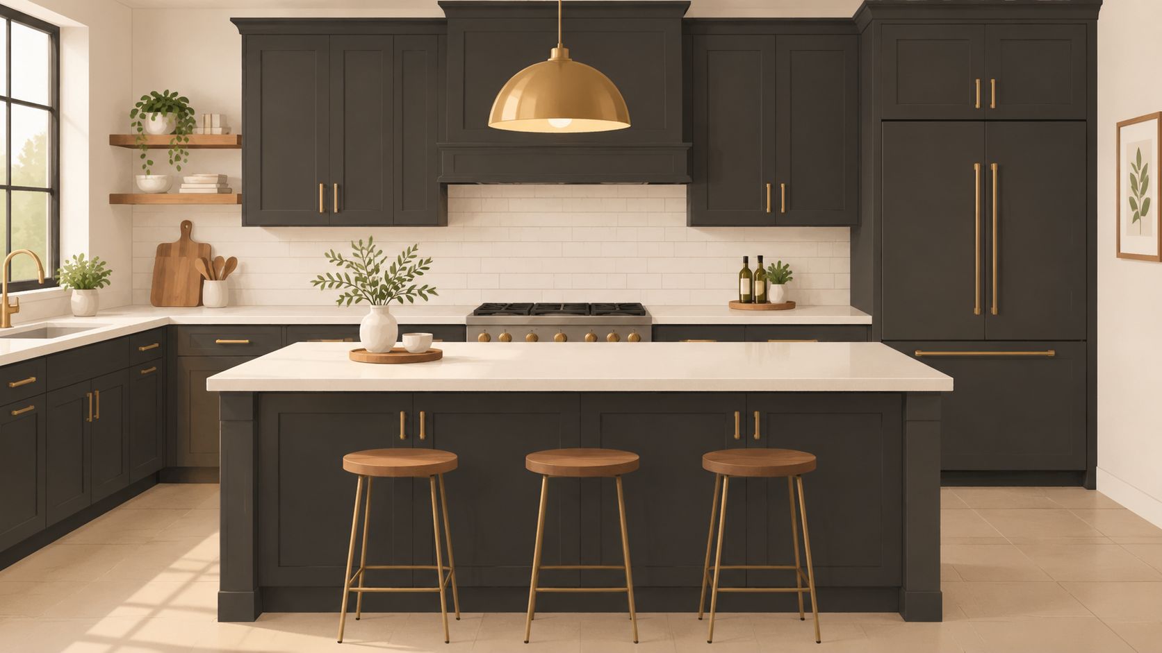
Warm white and gold create the easiest classic contrast for dark cabinetry. Charcoal, espresso, and black cabinets gain brightness from creamy walls, while brass or gold hardware adds a small amount of warmth without competing with the cabinet color. The result feels polished in a traditional kitchen and equally natural in a transitional one.
Choose a warm white rather than a stark blue-white. Cream, soft ivory, and gently warmed white paint keep dark wood from looking disconnected, especially when the cabinets have red, brown, or golden undertones. A light countertop with cream, tan, or soft gray movement can connect the wall color to the cabinetry more successfully than a brilliant white surface.
Make the contrast useful
White subway tile, simple shiplap, or a lightly textured ceramic backsplash keeps the scheme familiar while reflecting daylight. If the kitchen is shaded, reflective tile and pale walls help compensate for the way dark finishes absorb light. Design guidance from Homes & Gardens on cabinet, wall, and sheen relationships explains why lighter finishes can make a room feel more open, while glossy surfaces bounce light and matte finishes absorb more of it.
Use satin or matte brass where possible. High-shine brass can highlight fingerprints and feel overly flashy, while a softer finish reads more like a warm architectural detail. Layer under-cabinet lighting with ceiling fixtures so the hardware and cabinet depth remain visible after sunset.
This palette fits the classic refinement often seen in West Lake Hills and Westlake. It also translates well to espresso cabinetry with creamy walls in Round Rock, bright water-facing kitchens in Lakeway, and model-home styling in Steiner Ranch. Open shelving in white or natural wood can break up a long run of upper cabinets and prevent the room from feeling too dense.
2. Deep Navy and Soft Gray
Navy gives you drama without the severity of pure black. Against soft gray walls, it creates a calm, contemporary kitchen that feels refined rather than theatrical. The pairing works especially well with stainless steel, brushed nickel, or matte black hardware, although a small brass pendant can keep the room from becoming too cool.
The gray should be soft and visibly lighter than the cabinets. White trim, doors, and ceilings add definition around the gray walls and help daylight move through the room. Large windows and skylights are valuable with this palette because navy can become nearly black in shadowed corners.
Warm the cool side
Natural wood is the most reliable counterbalance. A light oak floor, walnut shelf, butcher-block accent, or wood island introduces texture and keeps the navy and gray combination from feeling flat. Use navy in a matte or satin finish. A very glossy surface can make painted cabinets look plastic, and it also makes fingerprints more noticeable.
The palette suits modern transitional interiors in Steiner Ranch and newer construction around Dripping Springs. It can also refresh kitchens in Cedar Park and Leander without requiring a highly specific decorating style. In downtown Austin lofts or renovated East Austin homes, navy cabinets with gray walls can feel crisp and architectural while still allowing vintage wood, art, or colorful furnishings.
The broader move toward deeper kitchen color is visible in industry reporting. A 2026 kitchen cabinet color report from Showplace Cabinetry described a professional survey of 634 kitchen and bath specialists, including 67% designers. The same coverage cited green and blue as popular kitchen colors and reported that designer inquiries for dark cabinets rose from 28% to 41% over three years. Those figures support the practical design direction here, use dark cabinetry as a focal point, then soften it with a lighter envelope and warmer materials.
3. Charcoal Cabinets and Warm Wood Accents
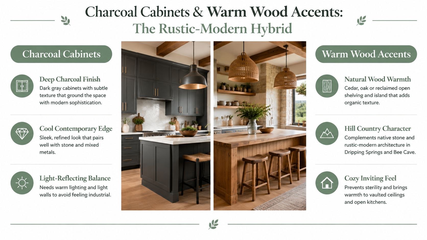
Charcoal and natural wood form a convincing rustic-modern hybrid. The charcoal grounds the kitchen, while cedar, oak, walnut, or reclaimed wood adds the tactile warmth that dark gray sometimes lacks. This is a particularly natural fit for Hill Country homes in Dripping Springs, Driftwood, and Bee Cave, where limestone, cedar, and outdoor views already influence the interior palette.
Start with a warm white, cream, or soft taupe on the upper walls. A fully dark wall treatment can make charcoal cabinetry and wood feel cave-like, particularly in a kitchen with limited windows. For the countertop, warm granite with gold or orange movement, honed slate, or another softly textured stone can bridge the cabinet and wood tones.
Let one material lead
A large stained wood island creates a strong warm anchor, but too many exposed wood surfaces can overwhelm the charcoal. Use open shelving selectively, perhaps on one wall or in a short display area. A stone or slate backsplash adds another natural layer without introducing a competing bright color.
Oil-rubbed bronze, wrought iron, and warm brass hardware all work. The darker metals create a quiet, integrated look, while brass brings a little more contrast. In Lakeway, charcoal and wood can echo water views and outdoor living. In Georgetown, the same combination can make new cabinetry feel more connected to historic wood details.
If existing hardwood cabinets have good construction but an outdated tone, cabinet restaining services from Restore My Kitchen ATX may offer a way to change the color direction without replacing the boxes and doors. Restaining requires the existing wood and finish to be suitable, so the final choice should follow an assessment of the cabinet material, condition, and desired result.
4. Black Cabinets and White Subway Tile
Black cabinetry with white subway tile remains one of the clearest ways to make a dark kitchen feel deliberate. The palette has a bistro quality, but it can also look minimal and contemporary when the cabinet doors are simple and the hardware is restrained. White walls and tile reflect light around the black cabinetry, which matters in compact kitchens as much as in large open-concept rooms.
The countertop should stay light if the room already has substantial black cabinetry. White quartz, pale natural stone, or honed marble creates a clean horizontal break. For the backsplash, gray or off-white grout is often more forgiving than bright white grout. It reduces visual busyness and can make cooking splashes less conspicuous.
Soften the graphic contrast
Warm lighting is important. Use warm LED under-cabinet fixtures and warm overhead illumination to prevent the white tile from reading cold beside black doors. A brass or copper pendant, chandelier, or sconce adds warmth without changing the core palette. Wood flooring, a live-edge shelf, woven counter stools, or natural textiles can do the same.
Matte black hardware creates a quiet monochromatic effect. Stainless steel offers a more professional kitchen character and works well when appliances already establish that finish. Keep upper walls and soffits light so the room doesn't close in visually.
Central Austin renovations, East Austin creative spaces, and historic-home updates often suit this palette because it respects both traditional geometry and modern restraint. It also works in farmhouse-inspired kitchens in Round Rock and Cedar Park, as well as contemporary builds in Steiner Ranch.
Before committing to the counter and backsplash, review guidance on choosing countertop materials. The surface's veining, sheen, maintenance needs, and relationship to the black finish should be evaluated together, not selected as separate decisions.
5. Espresso Cabinets and Buttery Cream
Espresso and buttery cream produce a comfortable, richly layered kitchen. The brown cabinet color brings depth, while soft yellow or golden cream walls reinforce its warmth. Unlike a black-and-white scheme, this palette doesn't try to create sharp opposition. It lets the cabinet's brown character remain part of the room's atmosphere.
Choose cream with a warm undertone. A cool or grayish cream can look mismatched beside espresso, especially when the cabinets contain red or amber notes. Warm stone countertops, golden granite, Tuscan-inspired marble, terracotta tile, and handmade-look ceramics all support the palette.
Build warmth in layers
Brass and copper hardware extend the golden quality across the room. A copper hood or warm stone range surround can become the focal point, while open shelving gives you space to display ceramics, wood boards, or collected pieces. Keep the display edited. Too many warm objects can make the room feel visually crowded.
Warm ambient lighting brings out the depth of espresso after dark. Under-cabinet fixtures should illuminate the countertop rather than merely create a glow beneath the uppers, and overhead fixtures should spread light across the work zones. The goal is a comfortable kitchen, not a dim one.
This scheme fits Mediterranean-influenced homes in Lakeway and Bee Cave, Hill Country properties in Driftwood and Dripping Springs, and welcoming custom interiors in Round Rock. It can also complement lakefront villas with warm stone, wood details, and views that supply additional natural light.
One trade-off is flexibility. Espresso and cream are highly compatible with warm materials, but they can fight with icy gray tile, blue-white paint, or cool silver finishes. If those elements are already fixed, introduce a bridging color through the countertop or backsplash before adding more hardware.
6. Dark Gray Cabinets and Warm Taupe
Dark gray and warm taupe offer a restrained contemporary refuge. Taupe blends gray and brown, so it softens dark cabinetry without pushing the kitchen into either a cold industrial look or a strongly rustic one. The palette is especially useful in open-concept homes where the kitchen needs to connect with adjacent living spaces.
Test taupe on more than one wall and at different times of day. Morning light can expose beige undertones, while evening bulbs may make the same color look noticeably warmer. A white or light gray countertop helps separate the taupe wall from the dark cabinets and prevents the room from becoming a single muddy block.
Add texture instead of more color
Matte or satin hardware, textured tile, natural wood shelving, and a lightly patterned backsplash give the neutral palette dimension. A metal backsplash can add a sharper contemporary note, while handmade ceramic tile creates a softer transitional effect. Warm wood flooring is another effective way to keep dark gray from feeling sterile.
This combination appears naturally suited to newer homes in Cedar Park, Leander, and Pflugerville, where clean contemporary lines often need a little softness. It also works for open-concept renovations in Round Rock and modern transitional homes in Steiner Ranch.
The palette aligns with broader professional interest in warm neutrals. Modern Kitchen VA's coverage of the 2026 NKBA design-professional survey reported that 96% of respondents identified warm neutrals as the dominant palette and 59% saw growing demand for dark wood finishes. Those figures reinforce a practical pairing, dark cabinets needn't be surrounded by stark cool white to feel current.
Use artwork, textiles, or small appliances to introduce controlled warm and cool accents. Because those pieces can change, they're a safer place to experiment than permanent paint or tile.
7. Walnut or Natural Wood Cabinets
Walnut and other naturally dark wood finishes create warmth through grain rather than paint color. Soft white or warm neutral walls let the wood remain the visual focus, while natural stone and restrained hardware support a crafted, organic character. This palette feels established because the materials carry the design instead of relying on a dramatic color contrast.
Use a countertop that respects the wood's warmth. Golden granite, warm marble, and natural stone can work well, while a sharply blue-white surface may make the walnut appear more orange by comparison. Stainless steel offers a clean, understated contrast. Brushed brass adds a warmer, more decorative note.
Protect the finish
Natural wood needs appropriate preparation and protection in a kitchen. A professional finish should account for moisture, temperature swings, cleaning, and the amount of direct sun the cabinetry receives. Warm, ambient lighting can reveal the grain beautifully, but it shouldn't leave work surfaces in shadow.
Walnut cabinetry is a natural choice in custom homes around Georgetown, Dripping Springs, and Bee Cave. It also suits established kitchens in West Lake Hills and Westlake, where original woodwork can be restored rather than discarded. In Lakeway, the organic material can echo the surrounding natural setting, while high-end homes in Round Rock and The Dominion can use walnut as a signature architectural feature.
For an existing kitchen, Restore My Kitchen ATX's perspective on the return of warm wood in Austin is relevant when deciding whether to preserve, restain, or replace a wood finish. The right route depends on the species, veneer condition, previous coatings, and whether the current layout still supports how the household uses the room.
Matching walnut open shelving can be beautiful, but it should be limited to areas where it serves storage or display. Too much matching wood can remove the contrast that gives the cabinetry presence.
8. Matte Black Cabinets and Sage Green Accents
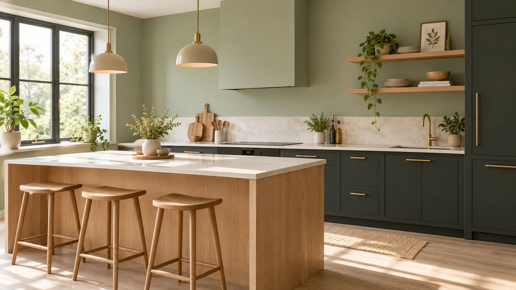
Matte black and sage green create a botanical palette with real presence. Sage softens black without making the kitchen pastel, while natural wood, brass, or warm copper adds the material warmth that both colors need. The result feels modern and calm, particularly when the room has generous daylight and views of trees or landscaping.
Select sage carefully. A muted green with neutral or slightly cool undertones can look clean beside black, but the same paint may become dull in a poorly lit room. Test it near the backsplash, countertop, and cabinet finish in morning and evening light before painting the full kitchen.
Keep the materials organic
Warm cream, soft gray, or golden-toned countertops prevent the palette from becoming cool. Natural wood shelving or an island base introduces grain and texture, while brass and oil-rubbed bronze keep the hardware from disappearing into the black cabinetry. Matte black fixtures maintain cohesion, but glossy black can look less considered and show reflections more aggressively.
Warm, soft lighting helps sage retain depth without casting an unwanted greenish tone across the room. Add herbs, potted plants, botanical art, or woven stools to reinforce the connection with nature. This combination fits eco-conscious homes in Dripping Springs and Driftwood, modern farmhouse projects in Cedar Park and Leander, and distinctive renovations in central Austin.
The palette also reflects the growing interest in saturated color alongside dark cabinetry. A Houzz kitchen trends summary found that white remained the dominant main cabinet color in renovated U.S. kitchens at 40% in its 2023 study, while wood-tone cabinets reached 24% after gaining 3 percentage points year over year. Among homeowners choosing a contrasting island color, black was selected by 12%, medium-tone wood by 12%, and dark wood by 11%. That pattern supports using dark finishes as a strong contrast element, not necessarily covering every surface.
8-Option Color Scheme Comparison for Dark-Cabinet Kitchens
| Style | Implementation complexity 🔄 | Resource requirements & cost ⚡ | Expected outcomes ⭐📊 | Ideal use cases | Key advantages 💡 |
|---|---|---|---|---|---|
| Warm White & Gold Accents – The Classic Elegant Contrast | Medium 🔄🔄, cabinet refinishing, hardware swap, lighting | Medium, warm paint, gold hardware, warm-toned counters ⚡ | ⭐⭐⭐⭐, Bright, timeless, upscale; strong resale 📊 | Traditional/transitional homes; Westlake, West Lake Hills, The Dominion | Luxury warmth, versatile with materials, high resale appeal |
| Deep Navy & Soft Gray – The Modern Sophisticated Balance | Medium 🔄🔄, cabinet repaint, coordinated trim/lighting | Medium, navy finish, matte black/brushed nickel hardware ⚡ | ⭐⭐⭐⭐, Dramatic yet calm; very photogenic 📊 | Modern/transitional builds; Steiner Ranch, Dripping Springs, urban lofts | Depth without harshness; durable hardware hides wear |
| Charcoal Cabinets & Warm Wood Accents – The Rustic-Modern Hybrid | High 🔄🔄🔄, woodwork, mixed-material integration | High, natural wood sourcing, sealing, custom work ⚡ | ⭐⭐⭐⭐, Cozy, textured, regionally authentic 📊 | Hill Country homes; Dripping Springs, Driftwood, Bee Cave | Organic warmth plus modern grounding; flexible styling |
| Black Cabinets & White Subway Tile – The Timeless Bistro Aesthetic | Medium 🔄🔄, precise finish, grout decisions | Medium, quality black finish, tile/grout, lighting ⚡ | ⭐⭐⭐⭐, Striking, classic, highly photographic 📊 | Central Austin, East Austin, modern farmhouse, compact kitchens | High-contrast impact; extremely versatile with accents |
| Espresso Cabinets & Buttery Cream – The Warm Maximalist Comfort | Low–Medium 🔄🔄, refinish/paint and coordinated accents | Medium, warm paints, brass/copper hardware, warm counters ⚡ | ⭐⭐⭐⭐, Warm, inviting, low-visible dust/fingerprints 📊 | Lakefront/Hill Country; Lakeway, Bee Cave, Dripping Springs | Cozy luxury, flattering environment, hides wear well |
| Dark Gray Cabinets & Warm Taupe – The Balanced Contemporary Refuge | Low–Medium 🔄🔄, refinishing, careful paint undertone selection | Low–Medium, common materials, neutral countertops ⚡ | ⭐⭐⭐⭐, Balanced, contemporary, broadly appealing 📊 | New subdivisions/open-concept homes; Cedar Park, Leander, Pflugerville | Versatile, ages well, forgiving of minor flaws |
| Walnut or Natural Wood Cabinets – The Timeless Warm Neutral | High 🔄🔄🔄, custom cabinetry, professional installation | High, solid wood, custom fabrication, sealing/maintenance ⚡ | ⭐⭐⭐⭐⭐, Timeless luxury, high perceived value, gains patina 📊 | High-end custom homes; Georgetown, Hill Country, luxury neighborhoods | Authentic grain, enduring craftsmanship, transcends trends |
| Matte Black Cabinets & Sage Green Accents – The Modern Botanical Refresh | Medium–High 🔄🔄🔄, precise matte finish, color + lighting balance | Medium, matte finishes, sage paint, wood/brass accents ⚡ | ⭐⭐⭐⭐, Fresh, biophilic, contemporary and calming 📊 | Eco-conscious and modern builds; Dripping Springs, Driftwood, central Austin | Botanical calmness, pairs well with wood/brass, trend-forward |
Choose the Palette That Fits Your Kitchen's Light
Start by identifying the cabinet undertone. Black and charcoal are usually more flexible with crisp contrast, while espresso and walnut need surrounding colors that respect their brown, red, or golden character. Navy can sit between the two, but its appearance changes substantially with daylight and sheen.
Test paint on large sample boards rather than relying on a small card. Move the samples beside the cabinets and countertop, then view them in the morning, afternoon, and evening. A wall color that looks balanced in direct sun may feel heavy in a shaded corner, while a warm neutral can become much richer under artificial light.
Choose the countertop and backsplash as a pair. The countertop is usually the larger visual plane, so its undertone and reflectivity should establish the direction. The backsplash then needs to support that relationship. For example, white subway tile can keep black cabinets bright, while stone or slate may be more successful with charcoal and wood. Reflective surfaces help circulate light, but excessive gloss can emphasize fingerprints, glare, and dated finishes.
Practical rule: Hardware should be the last major finish you choose, not the first.
Gold, brass, copper, bronze, stainless steel, and matte black can all work, but the right choice depends on the countertop, faucet, appliances, and lighting. Consider maintenance too. Dark cabinet doors can show dust and fingerprints, while highly polished hardware may require frequent wiping. Satin, matte, and textured finishes often offer a more forgiving everyday appearance.
Lighting deserves a layered plan. Combine ceiling illumination, under-cabinet task lighting, and decorative fixtures so the dark cabinetry remains legible rather than disappearing into shadow. The way color and sheen affect perceived brightness is summarized in design guidance on light management for dark cabinetry, where darker colors are described as absorbing more light and reflective finishes as bouncing more light around the room.
Austin-area conditions also matter. Homes in Buda, Kyle, Hutto, Pflugerville, Round Rock, Leander, Cedar Park, Lakeway, Bee Cave, and Dripping Springs can have very different window orientations, landscaping, and interior proportions. A palette that works in a sun-filled Lakeway kitchen may need lighter walls and stronger task lighting in a shaded kitchen in Buda or Georgetown.
If the existing layout works, refinishing, painting, or restaining may let you change the color scheme without removing usable cabinetry. If storage, lighting, countertops, or workflow also need improvement, a coordinated remodel can address those decisions together. Restore My Kitchen ATX serves the Austin metro with cabinet finishing, restaining, countertop coordination, lighting and finish planning, and full kitchen remodeling, with project-specific consultation and quoting rather than a fixed price list.
Restore My Kitchen ATX offers cabinet refinishing, painting, restaining, and coordinated kitchen remodeling for Austin-area homes, making it possible to match existing cabinetry to a dark-cabinet palette without automatically replacing the entire kitchen. Visit Restore My Kitchen ATX to discuss your cabinet condition, preferred color scheme, countertops, lighting, and next steps.